Client
WTS International
WTS International
My role
Brand concept
Visual system design
Production assets
Brand concept
Visual system design
Production assets
Challenge
WTS International required a distinct yet cohesive visual identity for its annual conference hosted in Toronto. The branding needed to celebrate the unique character of the host city while remaining consistent with WTS’s broader mission of advancing women in the transportation industry.
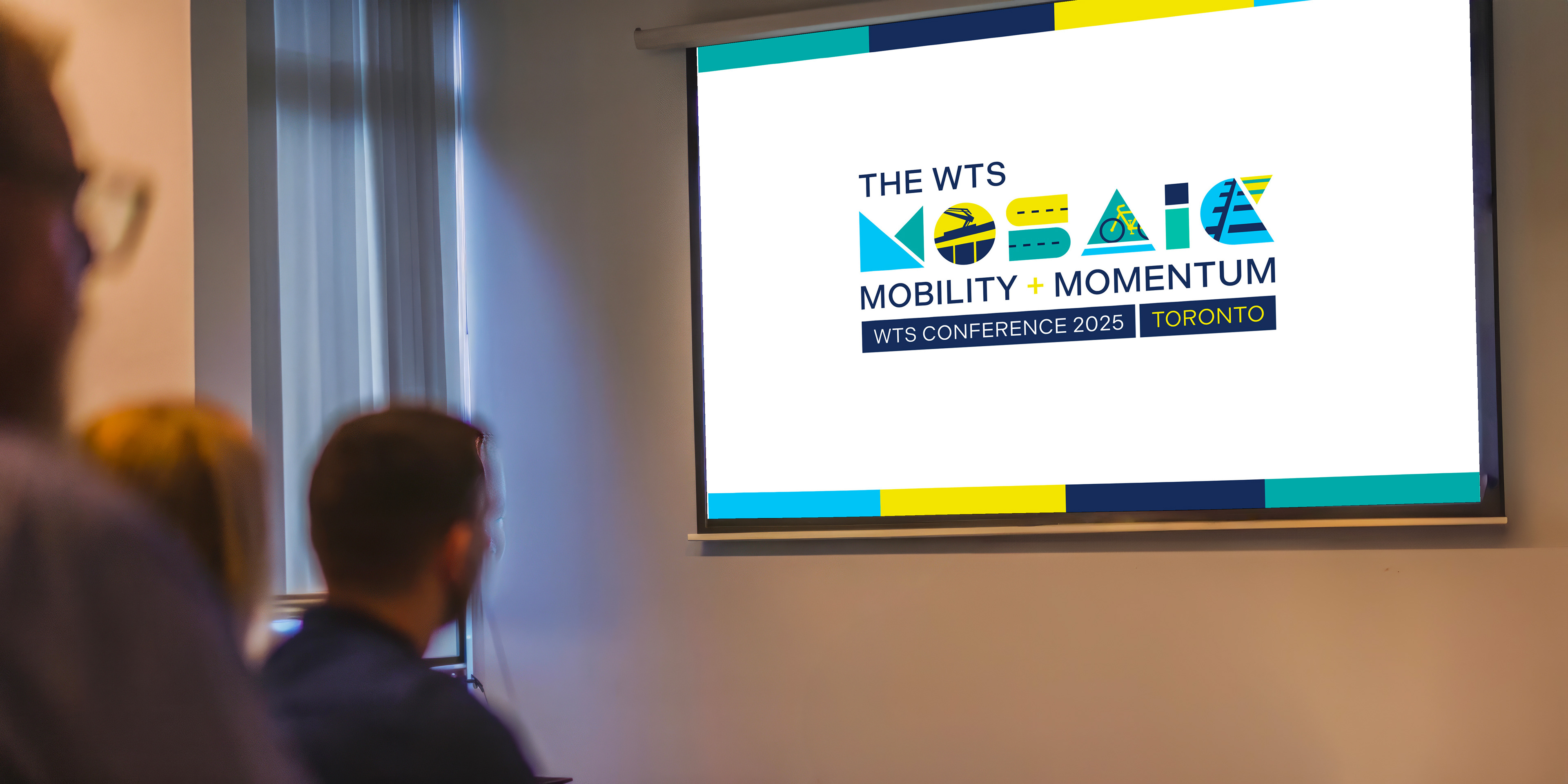
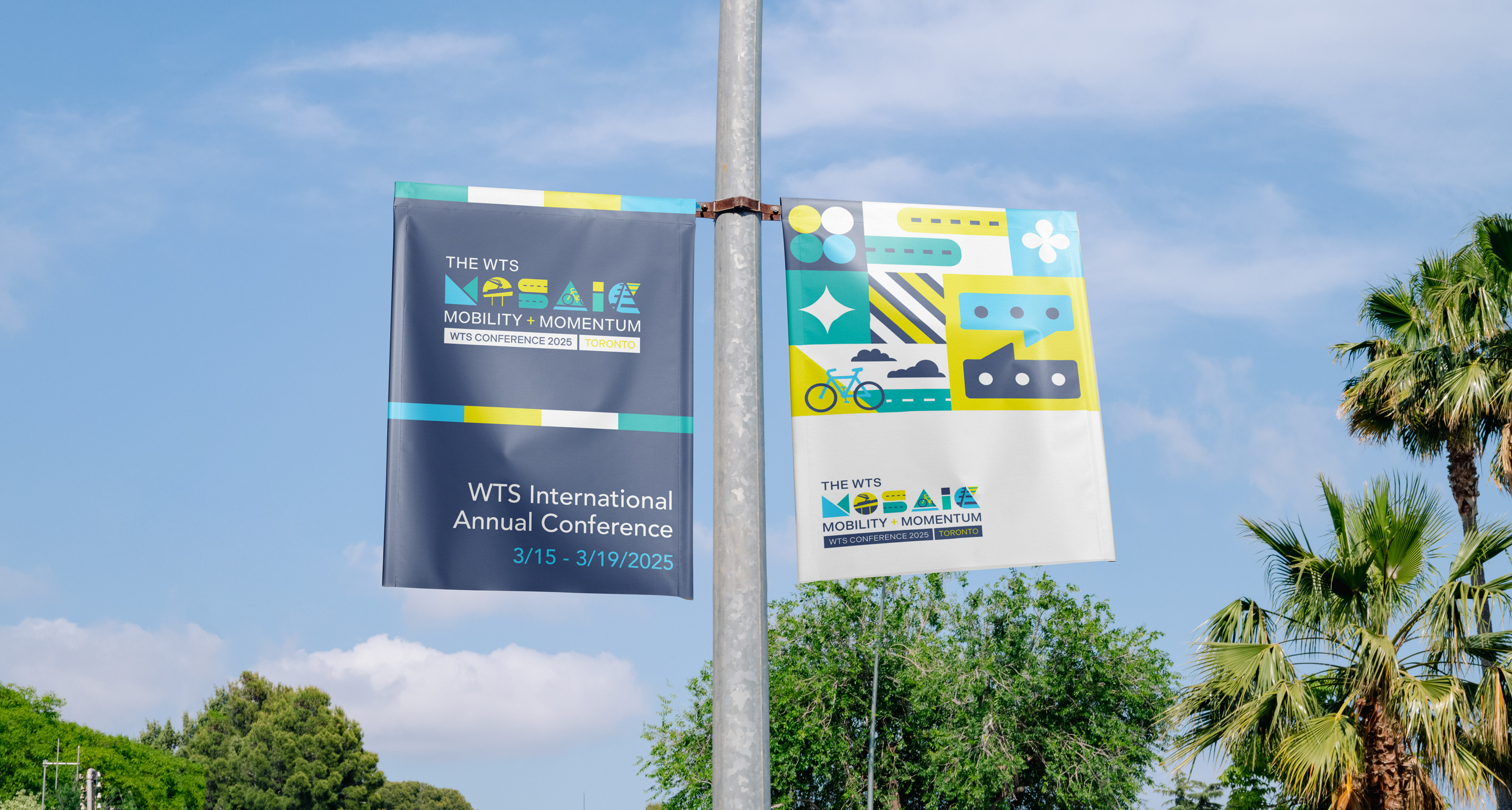
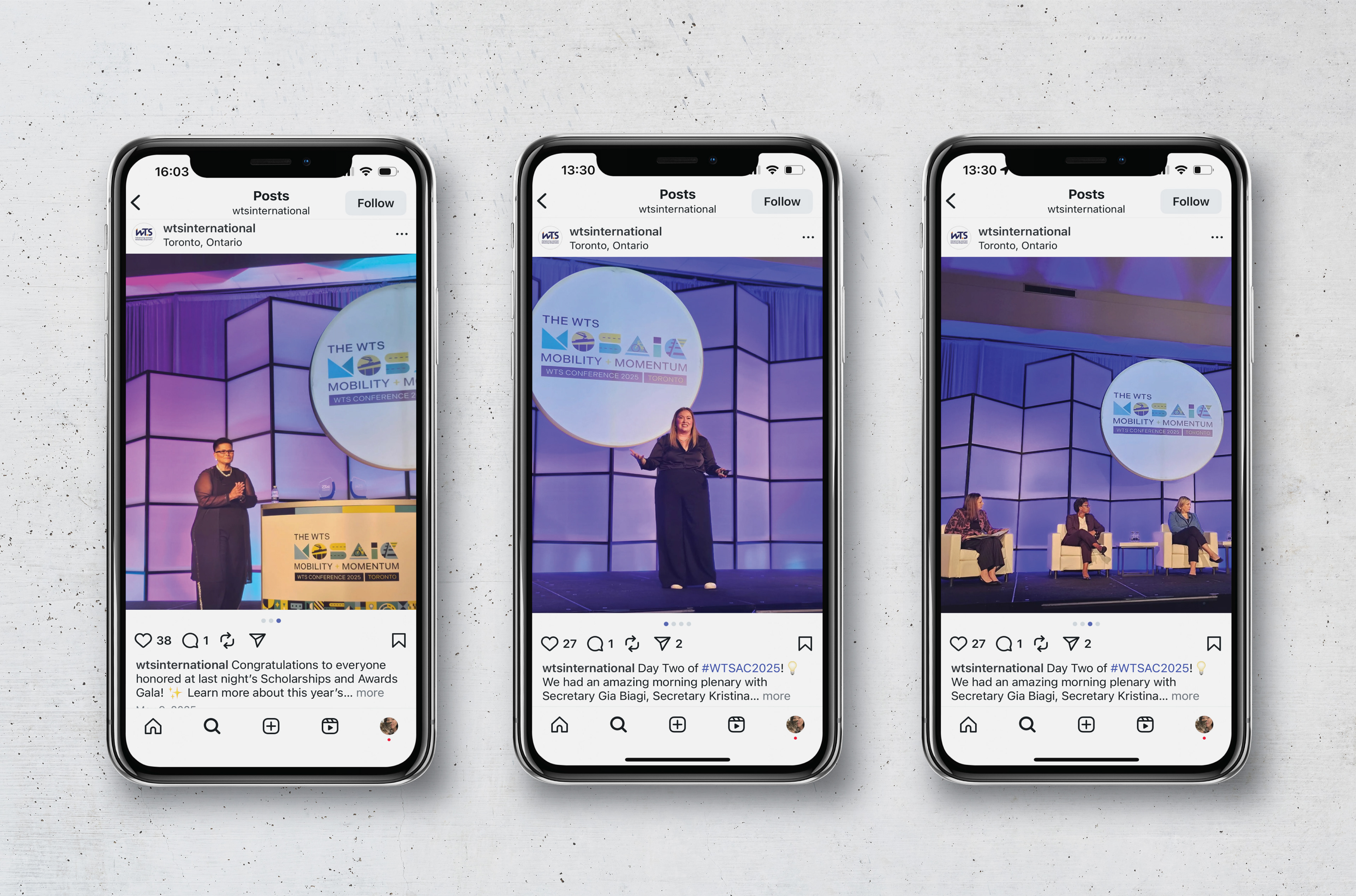
The design also needed to translate across a wide range of applications—including digital communications, conference materials, and large-scale environmental graphics—while resonating with a diverse professional audience. Additionally, the client intentionally requested avoiding traditionally “feminine” color palettes to reinforce that leadership in transportation is not defined by stereotypical visual cues.
Approach
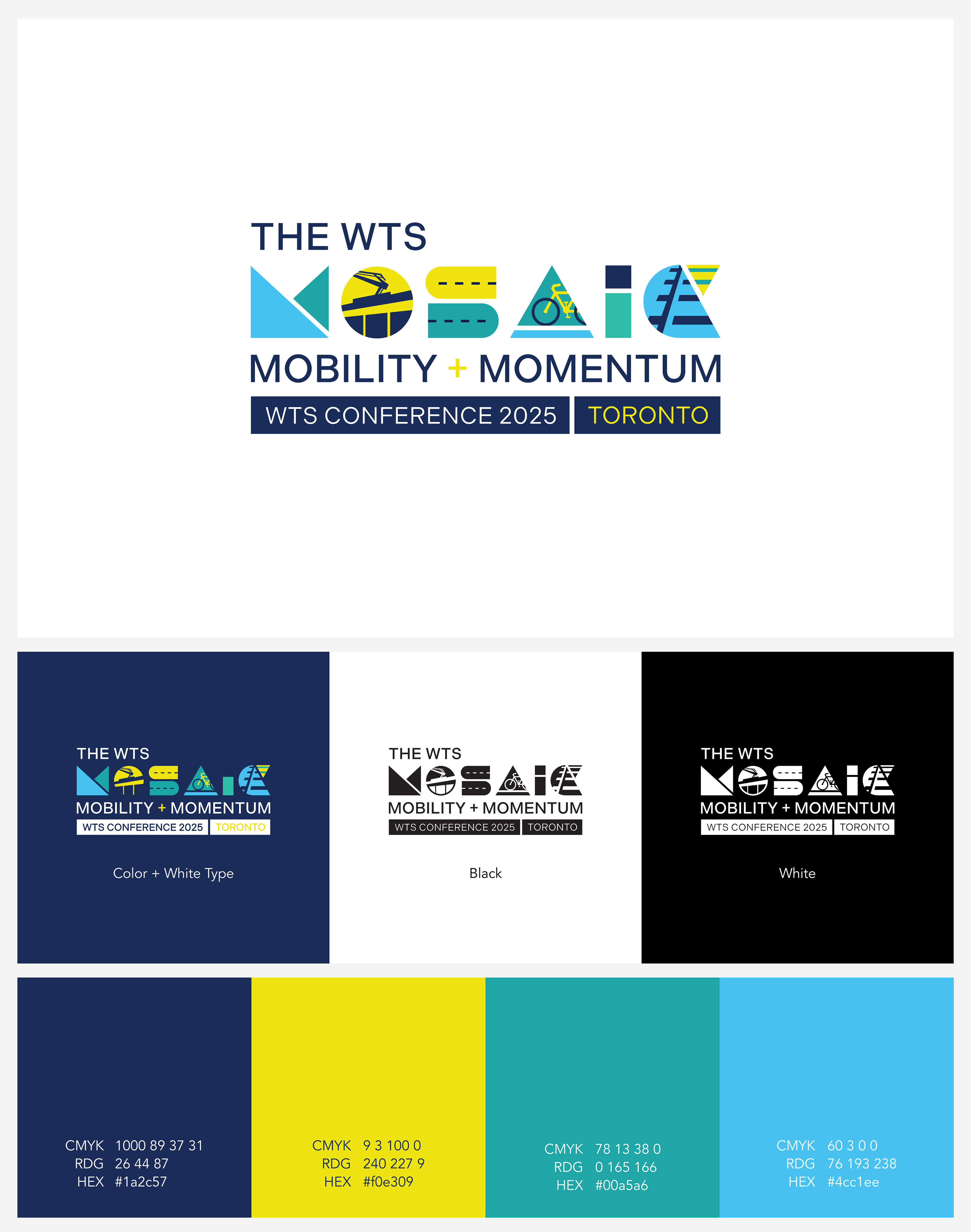
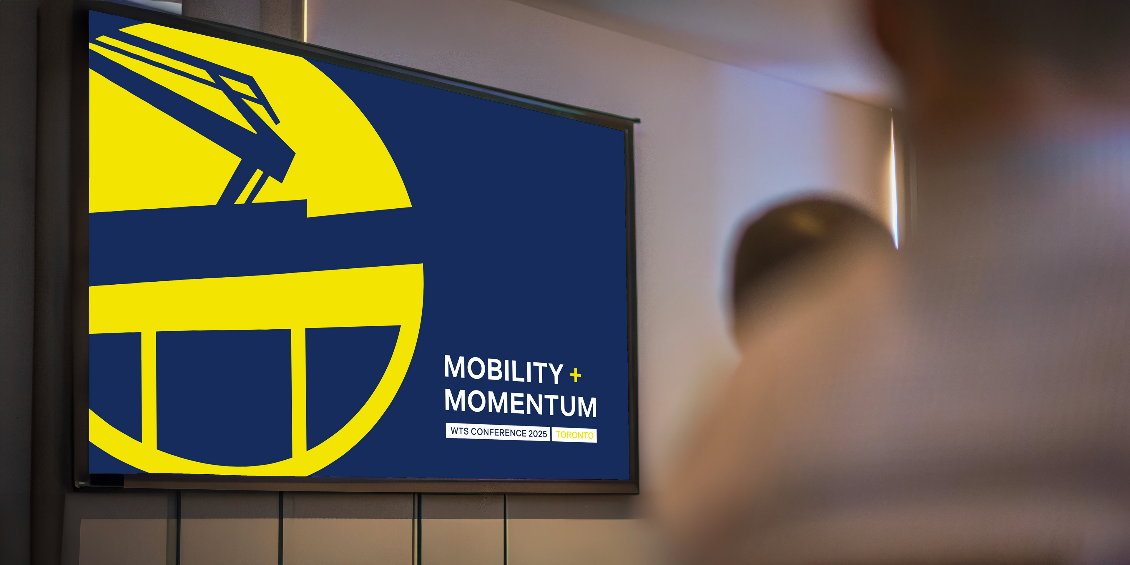
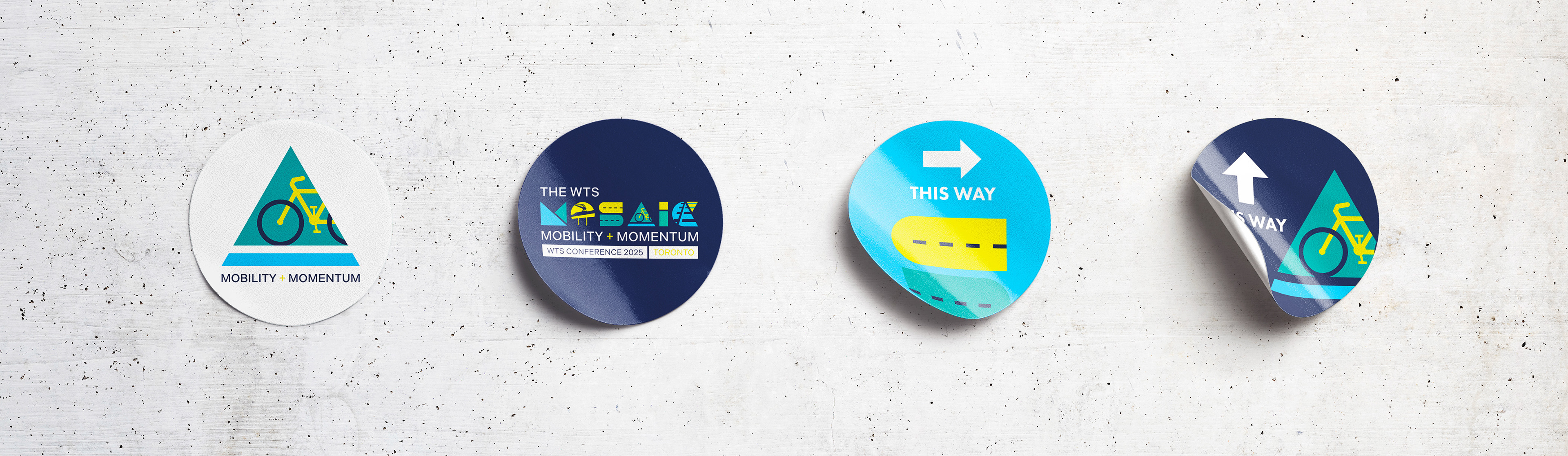
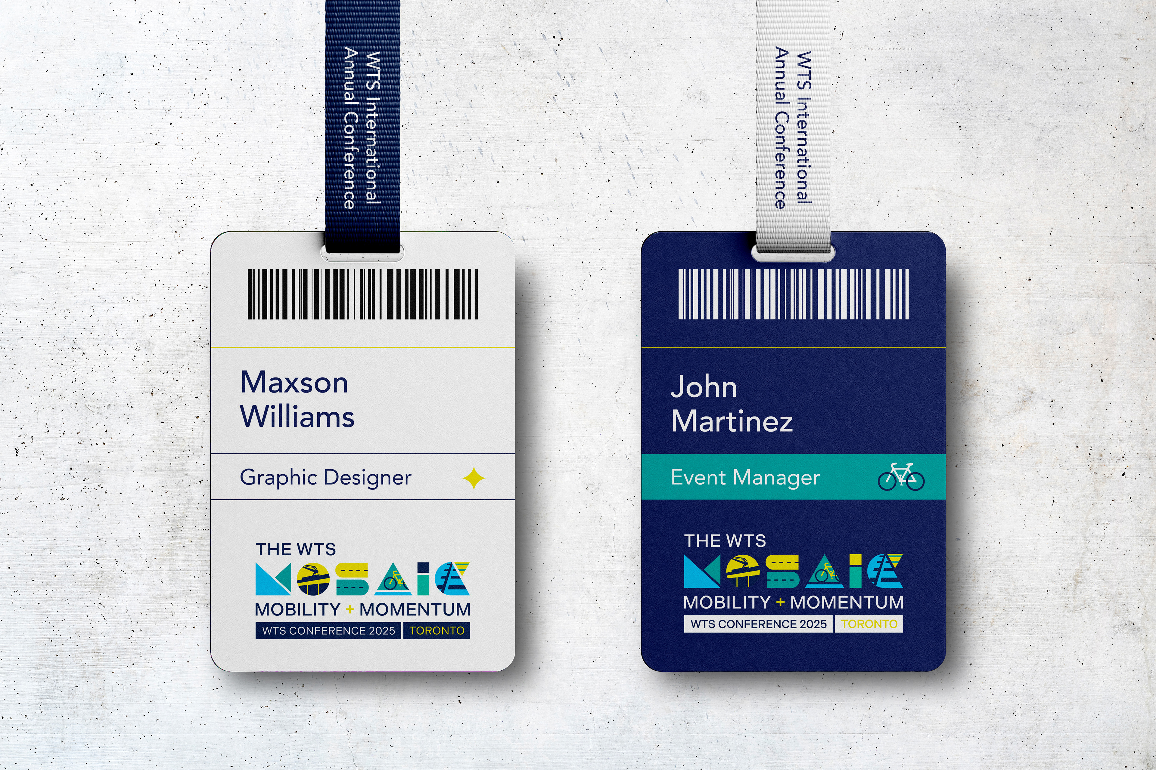
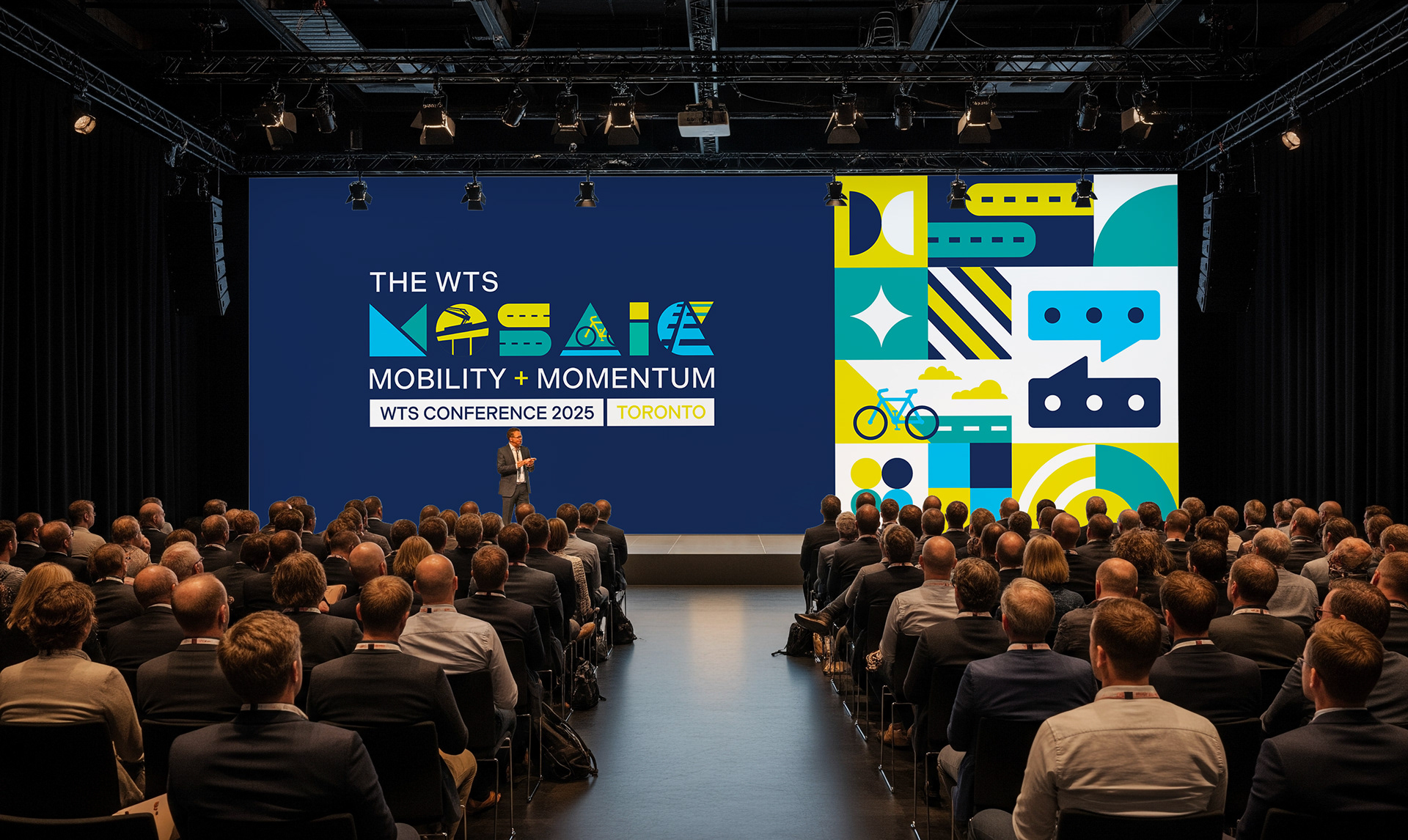
I developed a flexible conference branding system that balanced local inspiration with the established visual language of WTS. The identity uses geometric forms and transportation-inspired motifs to create a bold, contemporary logo that integrates positive and negative space to suggest movement and connectivity.
A palette of navy blue, sky blue, turquoise, and yellow was selected to convey professionalism, energy, and optimism while avoiding traditional gender-coded colors. Geometric typography and subtle transit references reinforce themes of infrastructure, progress, and diversity within the transportation industry.
The resulting identity system was designed to scale seamlessly across multiple formats—from digital promotional materials to conference signage—creating a cohesive visual experience that reflects both the spirit of Toronto and WTS’s mission of empowering women in transportation.